May 14, 2025

May 14, 2025
May 14, 2025

Webroot Cart Redesign

Webroot Cart Redesign

Webroot Cart Redesign

OpenText (Webroot Product Brand)

Dee Race

Designer

The Challenge | A multi-step checkout process losing users along the way

The Challenge | A multi-step checkout process losing users along the way

As the Senior UX Designer, I was tasked with redesigning the shopping cart experience for one of our eCommerce platforms. The existing multi-step cart was lengthy, cluttered, and caused significant friction in the user journey—resulting in lost conversions and frustrated users. With direct input from product, sales, marketing, and a third-party cart vendor, our goal was clear: reduce drop-off and create a faster, more intuitive checkout experience.

As the Senior UX Designer, I was tasked with redesigning the shopping cart experience for one of our eCommerce platforms. The existing multi-step cart was lengthy, cluttered, and caused significant friction in the user journey—resulting in lost conversions and frustrated users. With direct input from product, sales, marketing, and a third-party cart vendor, our goal was clear: reduce drop-off and create a faster, more intuitive checkout experience.

As the Senior UX Designer, I was tasked with redesigning the shopping cart experience for one of our eCommerce platforms. The existing multi-step cart was lengthy, cluttered, and caused significant friction in the user journey—resulting in lost conversions and frustrated users. With direct input from product, sales, marketing, and a third-party cart vendor, our goal was clear: reduce drop-off and create a faster, more intuitive checkout experience.

Project gallery

Project gallery

Project gallery

Project Overview

Cross-functional partnership to build a smarter cart

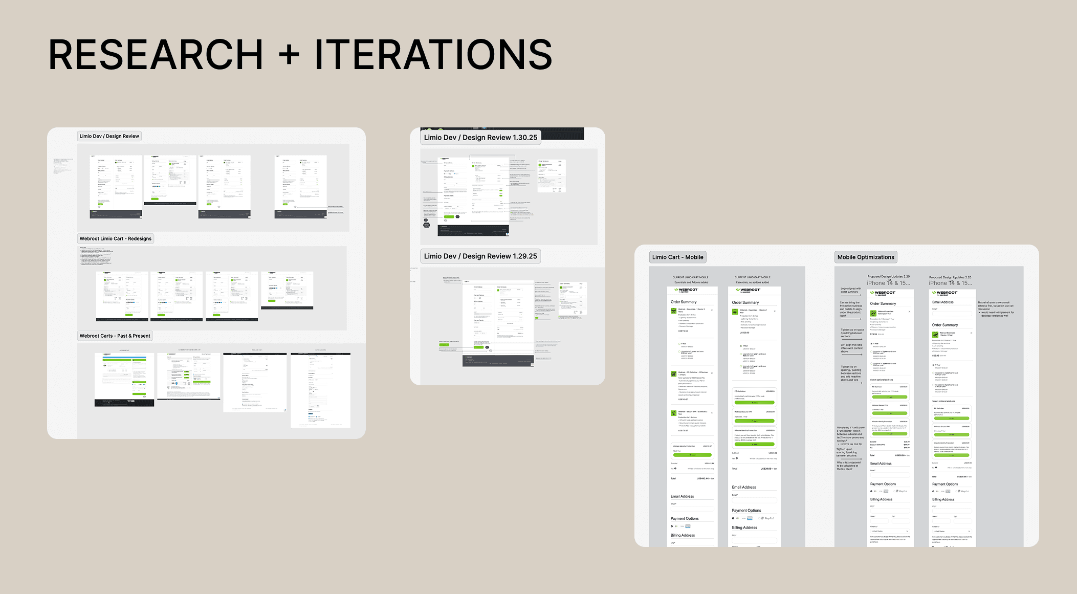
I led UX strategy and design, working closely with stakeholders across departments to identify pain points, technical limitations, and user expectations. From competitive analysis to wireframes and final UI designs, I partnered with the third-party development team to ensure the new cart was both technically feasible and aligned with user needs. Clear communication and iteration were key as we moved from early concepts to implementation.

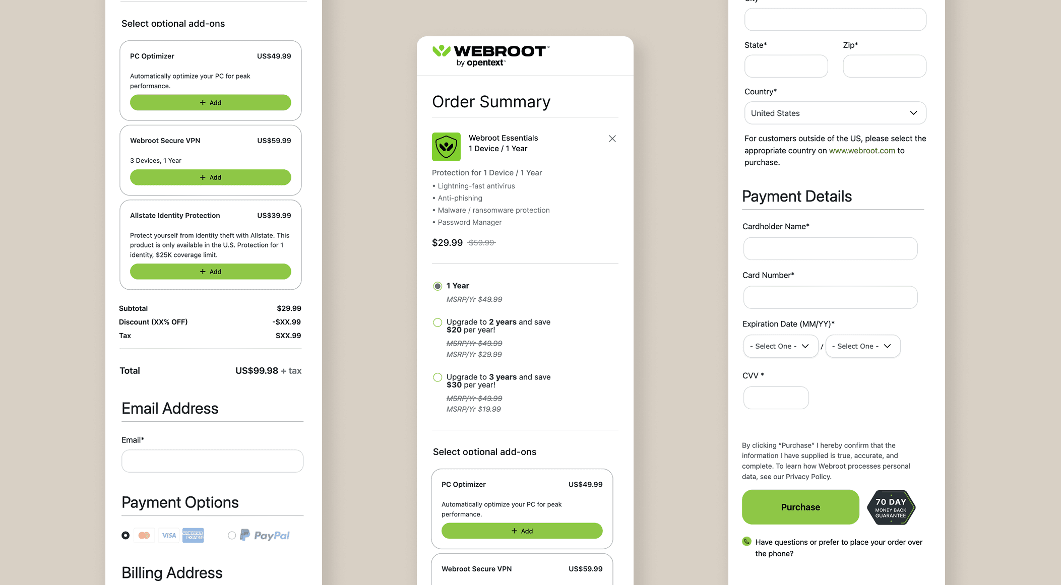
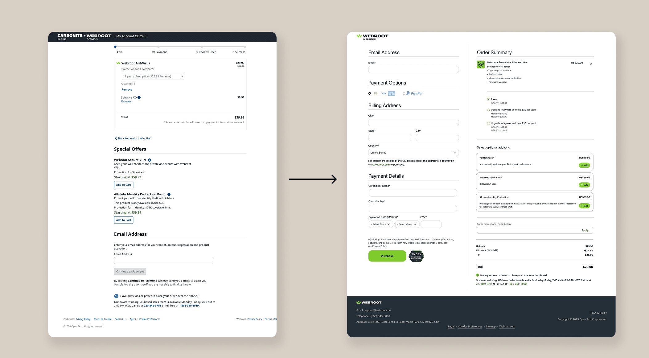
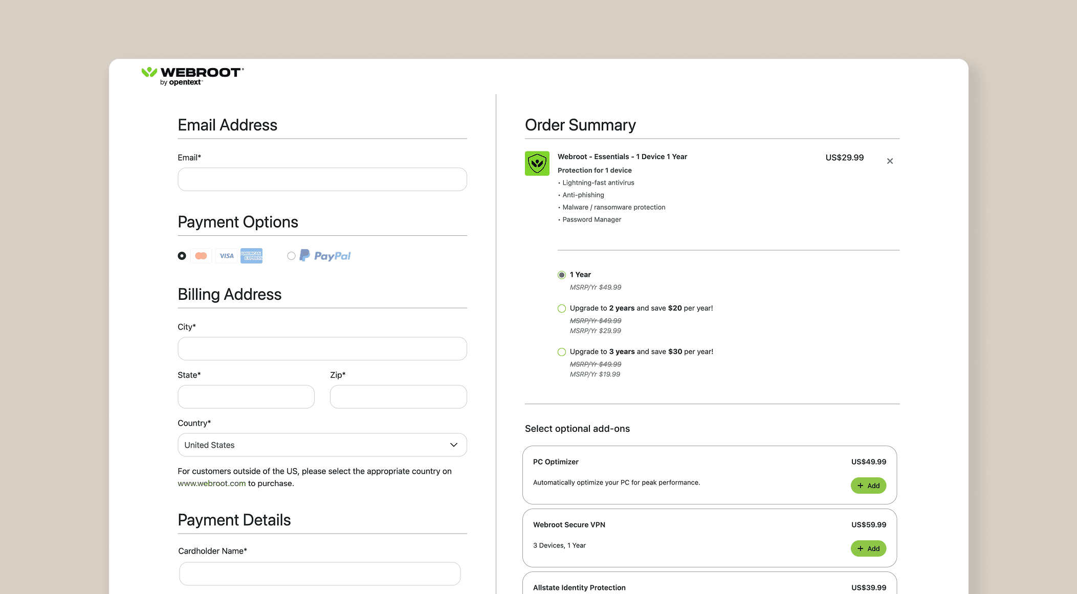
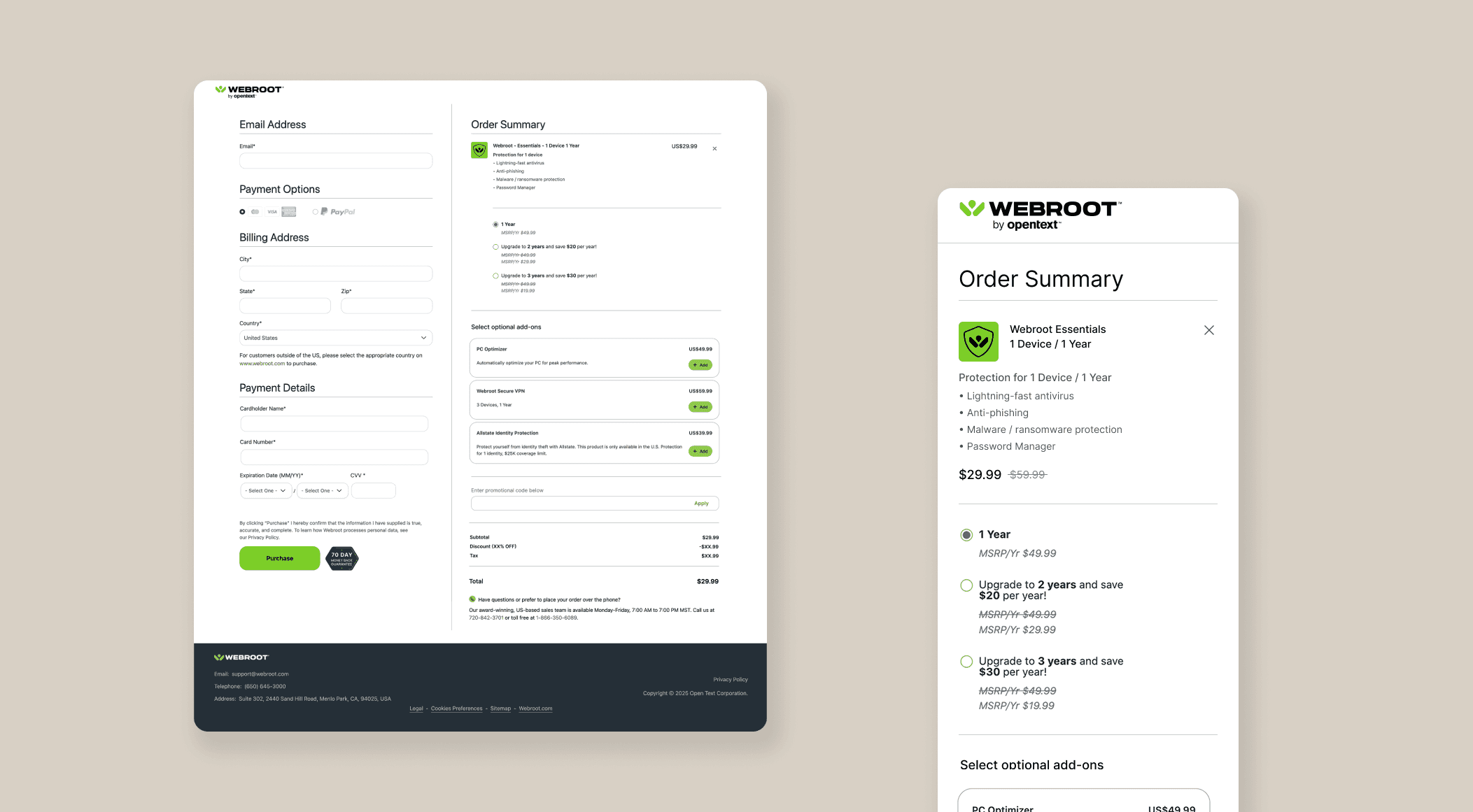
The Solution | A simplified, one-page cart experience

We reimagined the shopping cart as a direct, seamless one-page flow—reducing visual noise and eliminating unnecessary steps. By prioritizing clarity, responsiveness, and speed, we were able to streamline the entire checkout experience. The new design guided users smoothly through the process, reduced cognitive load, and removed common friction points present in the old system.

The Results

The new cart launched with a 7.4% increase in conversions—a direct improvement that reflected the success of the redesign. In addition to better business outcomes, the cart offered a vastly improved user experience: fewer clicks, less confusion, and a more efficient path to purchase. The project stands as a strong example of how intentional UX, backed by collaboration and data, can drive real impact.